How to Choose the Perfect Colors for Your Floral Arrangement
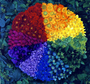
You’re ready to order your flower delivery for a birthday, anniversary or just to cheer up your home. But now you’re faced with the big question; what colours should you choose? There are a lot of different ways to do this, but if you’re just starting out in the mystical world of flowers by post then there’s one option that we’d highly recommend: the colour wheel.
It’s a really simple and useful tool for understanding what colours go together, and what doesn’t. People have used this technique for ages to decide on everything from home decor to fashion. It’s also used a lot by florists and flower shops to design gorgeous bouquets of different colour flowers. And we’re going to give you some tips on using it yourself.
Understanding the colour wheel
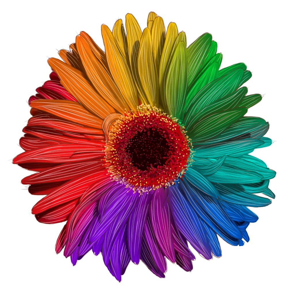
The colour wheel shows pretty much all the main colours you’ll find in a flower shop. It doesn’t include different shades but it does have the most common colour groups. This includes:
Primary colours:
- Red
- Blue
- Yellow
Secondary colours:
- Purple (blue + red)
- Green (blue + yellow)
- Orange (yellow + red)
Tertiary colours which are a mix of the primary and secondary colours, for example, red-orange, blue-green.
On top of this, you can look at ‘cool colours’ (blues, greens etc.) versus ‘hot’ colours (red, orange etc.) as well as neutral colours like white, black and grey.
Using the colour wheel
Here are some of the most common examples of combinations:
Monochromatic
Use of tints, hues, shades, and tones from only one section of the colour wheel. An example could be using Red/orange, rust, cinnamon, or red/violet, purple, or blue, pale blue, pink/violet, air force blue. These colours are all very similar so will naturally match nicely in your bouquet. (A great option when you need fast, next day flower delivery, as it’s easy to put together.)
Complementary
This colour choice is where you select two colours from opposite ends of the colour wheel. For example, you could have red and green, red/violet and yellow/green, or blue and orange.
Split Complementary
 Here you use one main colour combined with another one on either side of the opposite palette. Examples include green & yellow opposite red/violet or red & violet opposite yellow/green.
Near Complementary
With this approach you choose one colour and then one of the two colours besides its' complementary. Common combinations include Red/violet and yellow
Red and blue/green violet and yellow/orange.
Contrast
Uses one main colour with one that is three full sections away in the colour wheel. This approach can create harsh combinations but are often very impactful. Examples include yellow and red, green and orange, or orange and violet.
Analogous
Here you combine 3 or 4 colours that are beside each other in the colour wheel but you only include one primary colour. For example, you might combine yellow, yellow/orange, orange, red, red/violet, violet, blue/violet or green, blue/green, blue, blue/violet
Triadic
This is a quite striking option where you select 3 colours that are set apartby 3 full segments in the wheel. It’s best to choose 1 colour that is dominant, with less of the 2nd, and even less of the 3rd one. Examples include green, orange, violet, red, yellow, blue or yellow/green, blue/violet, and red/orange.
Tetradic
Finally, this option is about choosing colours that are set apart by 2 full sections in the colour wheel. Examples include green, yellow/orange, red, blue/violet, yellow, red/orange, violet, blue/green.